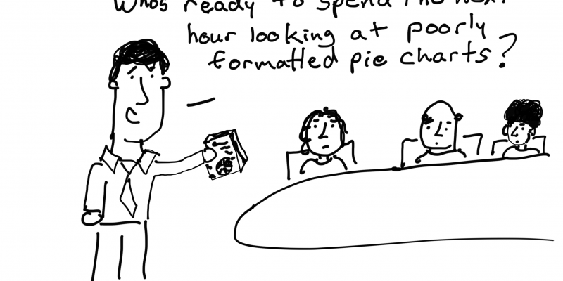
I’m pulling from my archive this week. Cartoons will be all about data visualization.
Serve up Survey Data with a Menu Infographic
During this week’s Thursday discussions over at diydatadesign we’ll be talking about different strategies for visualizing survey data. Preparing for that call inspired this post. The Problem Surveys are not setup in a narrative format. So after the results roll in and it’s time to sit down in a meeting to go over the results, you could be […]
Reporting for the Small Screen
Just a guess here, but I don’t think smart phones are going away anytime soon. I think it’s time to really start focusing on how we can use the technology as a reporting tool. And stop pretending that it’s not the place where a large number of our stakeholders engage with our programs on a […]
Creating GIFs to Explain Charts
So who has time to read the small print? We are in an age where even large print is rarely read. Unfortunately there a lot of really good charts that require at least a little bit of explanation. So how do we convey that information to the audience? Could we use a GIF? What are […]
Why you shouldn’t decrease your data-ink ratio.
From Edward Tufte’s The Visual Display of Quantitative Information: A large share of ink on a graphic should present data-information, the ink changing as the data change. Data-ink is the non-erasable core of a graphic, the non-redundant ink arranged in response to variation in the numbers represented. Then, Data-ink ratio = data-ink / total ink used to […]
Hans Rosling as a performer.
I think we tend to undervalue Hans Rosling as a performer while hyping his data visualization. When you first watched his early *TED talks did you think, “Maybe I should create a bubble chart?” Or did you think, “I wish I could captivate an audience like that?” Originally for me it was the former and […]


